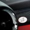
DimON Опубликовано February 10 Жалоба Share Опубликовано February 10 For the past decade, in-car UI has followed a predictable path: bigger screens, more plastic, and fewer physical controls. Today, Jony Ive and Marc Newson delivered a striking counterpoint. Their vision, revealed inside Ferrari’s first all-electric model, the Luce, embraces analogue switches, metal enclosures, and screens that respond to the physical controls around them. It’s a masterclass in restraint and precision, and it’s already sending ripples through the industry. Rather than default to the industry’s touchscreen?heavy orthodoxy, Ive, Newson and their team LoveFrom appear to be pursuing something subtler: a well?balanced blend of physicality and digital finesse. Steel and glass meet OLED, analogue dials meet configurable digital gauges, and essential controls stay tactile rather than buried in endless menus. The work evokes Ive’s Apple legacy, minimalist, function?rich, and unmistakably tactile, but with an automotive soul. And let’s not forget Newson’s ground-breaking Ford 032C concept (named after the Pantone color) from 1999. Ferrari’s Interface Philosophy: A Reminder That Less Can Be More One of the biggest notes from the Luce’s reveal is how deliberately Ferrari has steered away from making the cockpit “all screen, all the time.” Instead, the interface team focused on clear, direct interaction: physical buttons where they still make sense, contextual digital feedback where appropriate. This isn’t just about aesthetics, it’s about keeping the driver connected to the machine without digital distraction, a design ethos that feels almost analog in a world obsessed with touchscreens. This heritage?inspired minimalist approach actually reveals something interesting about automotive UI design overall: more pixels don’t automatically mean a better experience. Instead, Ferrari and LoveFrom seem to be saying: quality of interaction matters as much as quantity of info. Another important note is the shape of the screens which forgo the typical elongated or free-form center screen and instead use an iPad-like ratio. To us, that’s a human-centered approach that may sound like a nuance but in reality will have a real impact on approachability. BMW iDrive: Powerful, But Still Entangled in Complexity Contrast that with what BMW has been doing with the latest iDrive, the long?standing infotainment pillar across the brand. Originally groundbreaking, integrating controls from radio to climate and nav into a single united system, iDrive has evolved rapidly. With iDrive 8 and its successors, BMW has pushed big, bold screens and expansive functionality, from large panoramic displays to voice and gesture interfaces. But while the visuals and feature list are impressive, critics and owners often point out that ease of use still lags behind the promise. Menus can be deep, functions can be buried, and learning curves remain steeper than they ought to be for systems sold on premium cars, a reminder that clever tech still needs clever presentation to be truly delightful. BMW’s latest iDrive is truly ground-breaking with its panoramic display. But having used the latest release just this past week, it’s still not quite perfect. The haptic controls on the steering wheel lack the tactile quality that you need when navigating menus at speed and the system has more lag than you’d expect given the processing power onboard. Still expect it to evolve into a market leader within 6-12 months. And MINI? MINI, for its part, has historically punched above its weight with playful UI elements and theme?rich digital accents. But its infotainment experience has generally borrowed heavily from BMW’s broader software ecosystem. That’s not surprising given shared platforms, but it does raise the question: could a more distinctive, driver?centric UI benefit MINI’s brand identity? MINI fans are a particular breed: they care about character and connection as much as they care about connectivity. A Ferrari?style rethink — where the UI supports that character instead of overshadowing it — could be a way for MINI to avoid the “me?too screen crowd” and build an experience that feels like a MINI, not a smartphone on wheels. What This All Means for the Industry Ferrari’s Luce interior may feel exotic and exclusive, but it signals a broader shift in how carmakers, especially those rooted in performance or character, are thinking about the digital cockpit. It isn’t just about screens anymore. It’s about how digital and physical layers coexist without compromising driver focus, tactile feedback, or brand identity. It if sounds familiar it’s because we wrote about the exact same things yesterday. For BMW and MINI, that’s both a challenge and an opportunity. BMW’s tech is powerful, capable, and feature rich, but it still wrestles with complexity. MINI’s personality is perfect for experimentation, but it needs a UI vision that feels as deliberate as its covetable design language. Ferrari’s collaboration with Ive and Newson reminds the industry that great interaction design doesn’t come from piling on features, but from integrating them in a way that feels purposeful. And as cars become ever more digital, that principle might just be the most important part of the driving experience, regardless of the badge on the hood. The post Ferrari’s Bold UI Move Is the Lesson BMW and MINI Can’t Ignore appeared first on MotoringFile. View the full article Ссылка на комментарий Поделиться на другие сайты More sharing options...
Recommended Posts